Love and Coffee
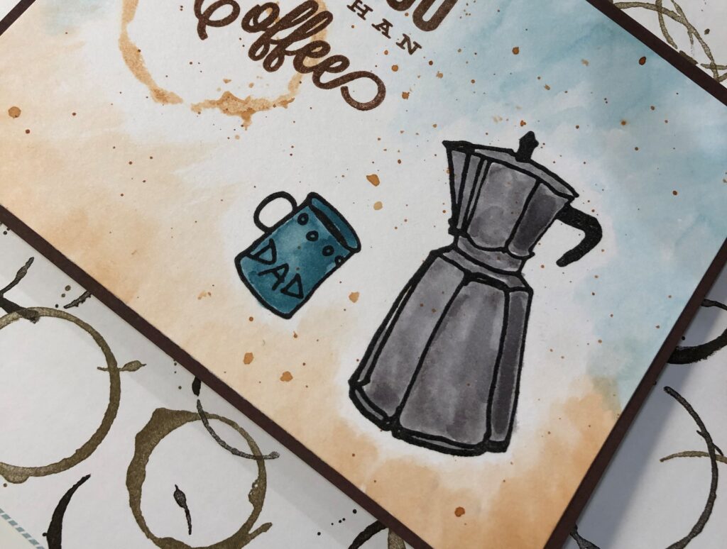
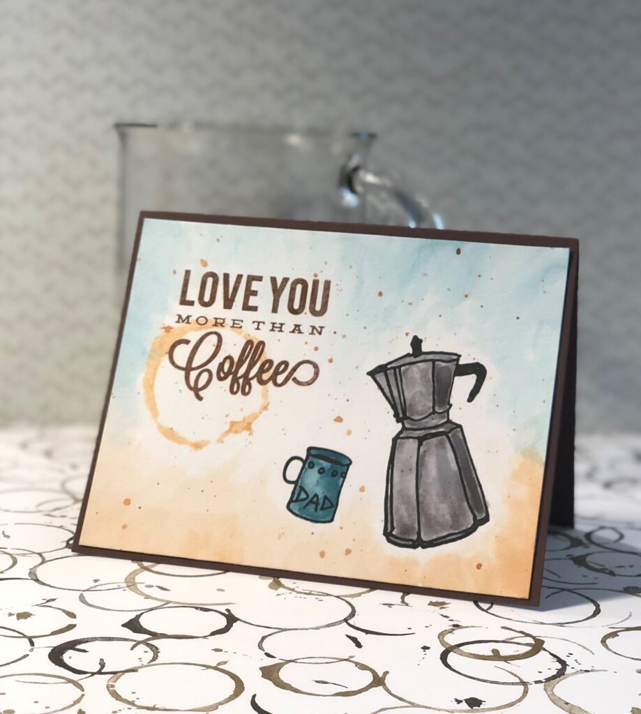
My fifth submission to the Altenew Educator Certification Program is from the class “For the Guys”. Jennifer Rzasa taught some wonderful techniques for making cards that will give joy to our gentlemen folk. I got the Coffee Love stamp set from Altenew a long time ago and had yet to do anything with it. Aha!… guys like coffee! Okay… girls do too, but that’s beside the point! 🙂 I really like the old timey coffee pot that I used for the card – it’s the whole reason I bought the set. It is just like the one my parents used when I was little, so very nostalgic to me, good memories.
For this card I sought help from husband, he is a guy, with a guys perspective, and he knows what he likes in a card. He was great help, although, he did stifle my bling usage. I know it was for good reason… but still!
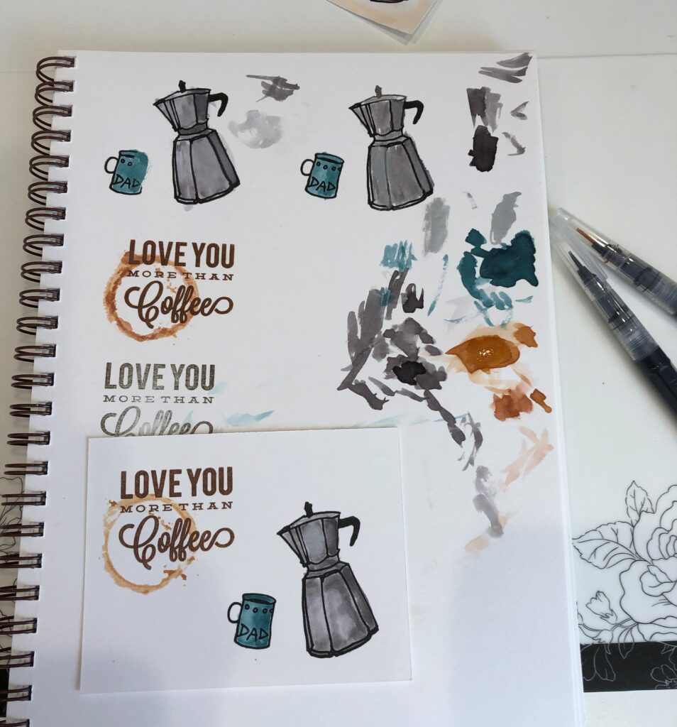
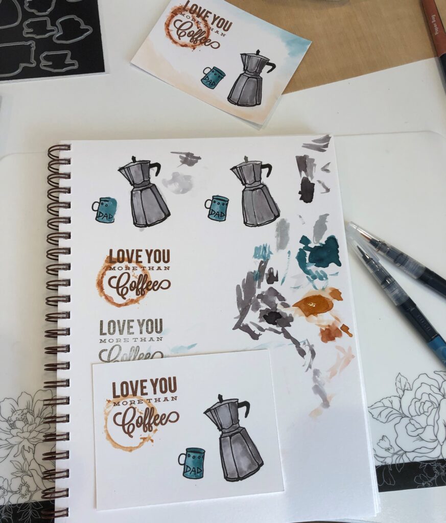
If I am going to be using multiple stamps on a card, I like to first decide how big I would like my focal piece to be, then lay the stamps on it. This way I can arrange them, see how they look and adjust my focal piece/paper size if needed.
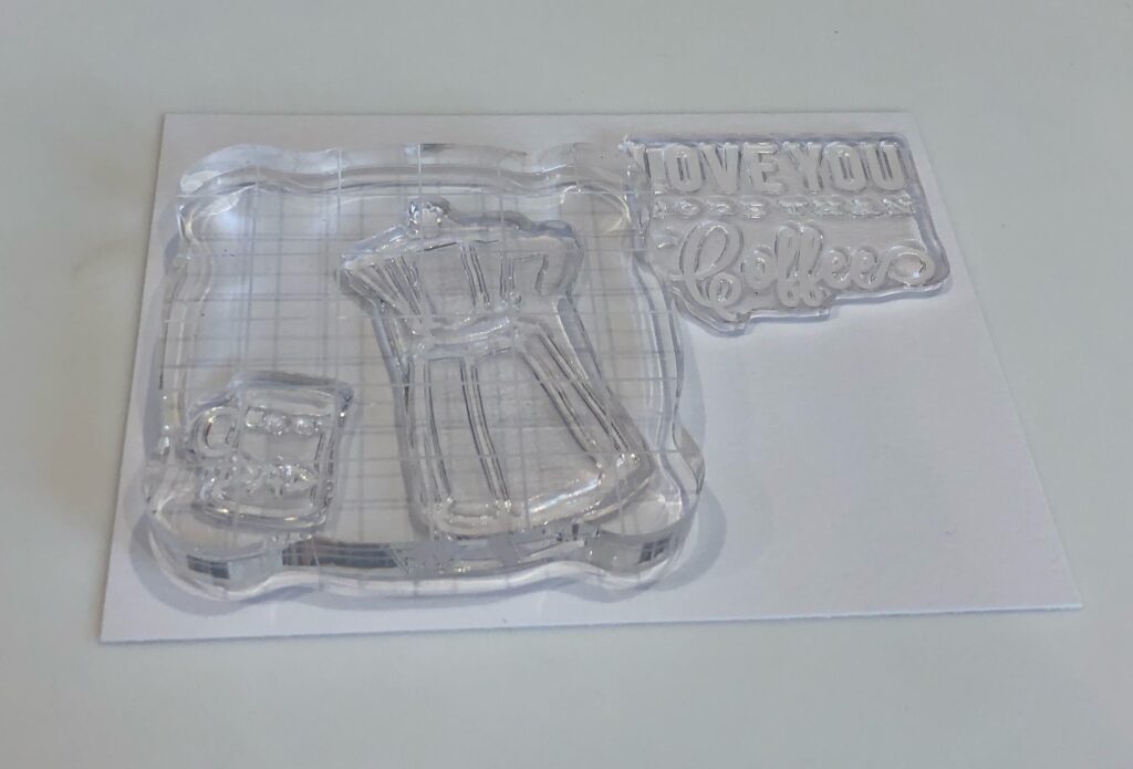
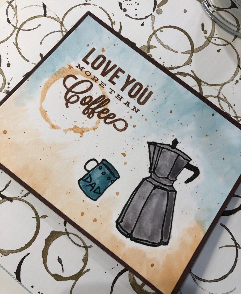
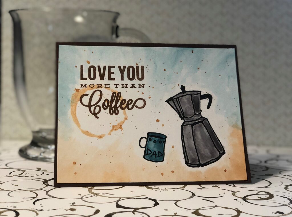
After choosing my layout I stamped the coffee pot and cup in Versafine Black Onyx ink and the saying in Versafine Vintage Sepia ink. The Versafine ink is good when you want to use watercolors as it is a fast drying waterproof pigment ink. I used Strathmore 140lb mixed media paper cut to 5 1/4” by 4″.
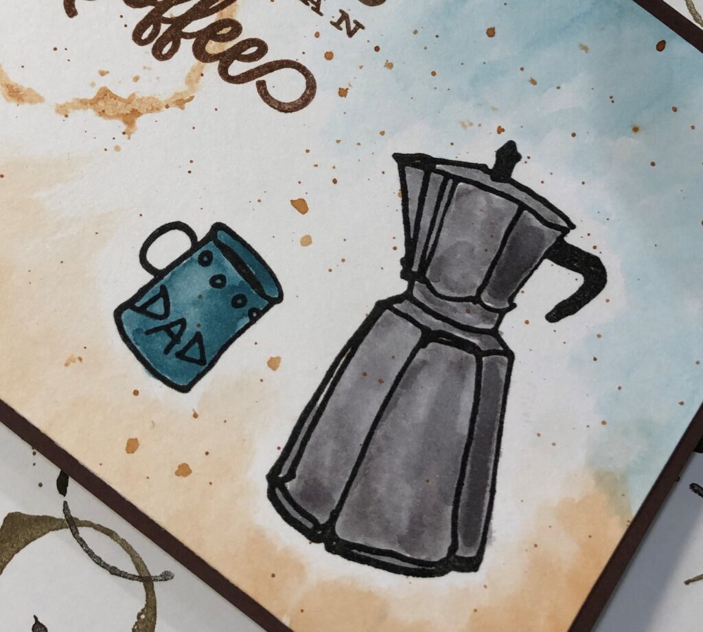
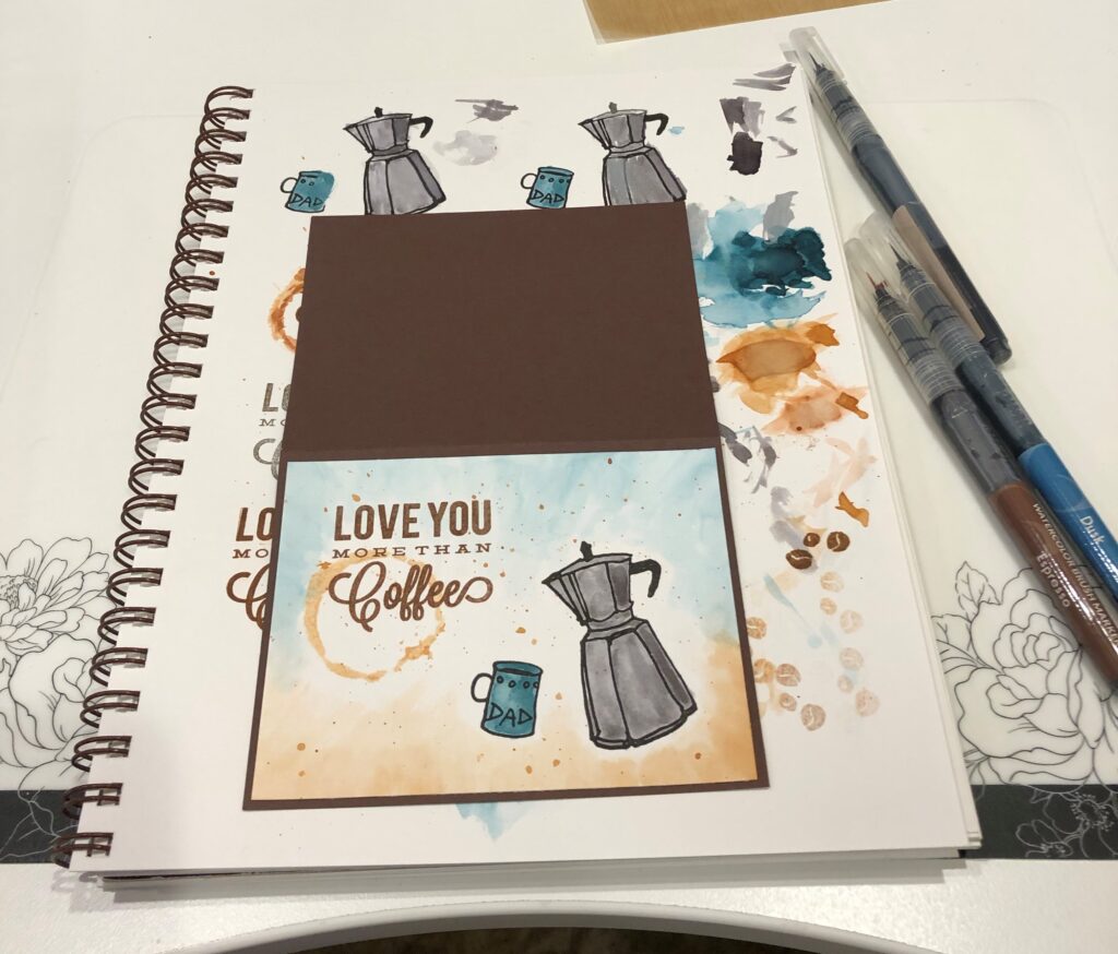
Next came the fun part of coloring! I used Altenew Watercolor Brush Markers in Dusk, Evening Gray, and Espresso. I like to practice coloring in my mixed media journal, plus it makes a great palette.
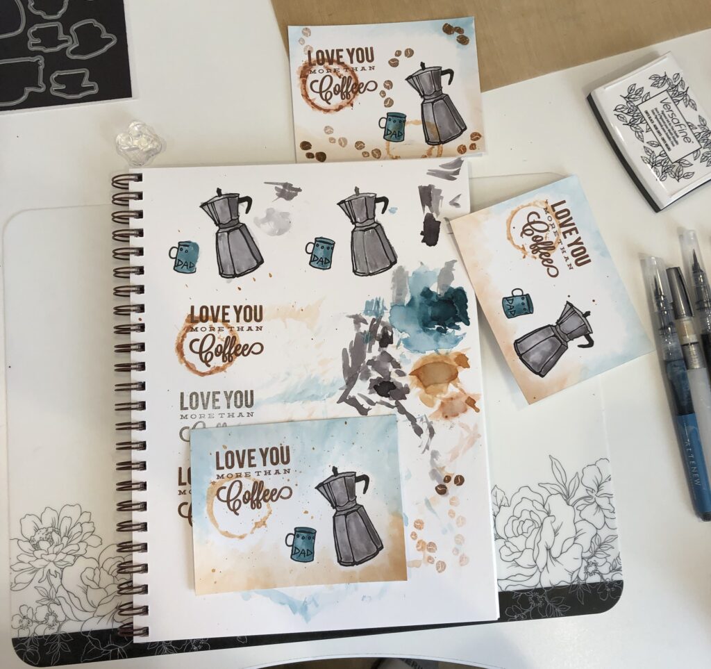
I painted the coffee pot with Espresso and the cup with Dusk watercolors. Then I took the Coffee Ring stamp from Altenew and colored it with Espresso watercolor marker and stamped it over the saying. Being watercolor really made it look like a coffee ring stain. I then used a wet paint brush to pick up some Dusk watercolor from my journal/palette and swiped it all around the top of the card, carefully going around the ring and pot. I did the same with Espresso watercolor for the bottom.
The card still looked naked, and since bling was out, I had to come up with something else. I started playing around with coffee beans which just didn’t fit; maybe another coffee ring – no. And then as I was moving my Espresso watercolor pen (after trying out another coffee ring), I accidentally splotched some on the card… spilled coffee! The splattering began in earnest, along with some bigger splotches where I gently touched the pen to the surface, then soaked up the residual with a paper towel.
I made a card base using Stampin’Up Chocolate Chip card stock cut to 8 1/2” by 5 1/2” for a finished card of 4 1/4” by 5 1/2“. I adhered the focal piece to the card base with double sided tape.
I really enjoyed making this card, especially since my husband Ray was involved. It was great to bounce ideas back and forth and create something we actually both like. So thank you Ray! And yes, I do love you more than coffee! 🙂

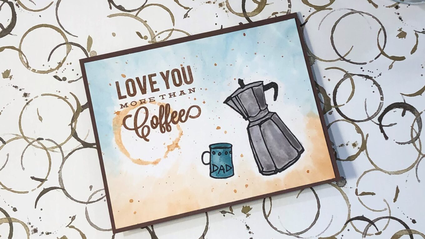


Perfect masculine card! Love the watercolour, rustic look. Thank you for sharing.
Thank you Erum!
Great card Carol! Think I might involve my hubbie when I get to the masculine card. Wonderful idea and it looks like he gave you some awesome input 🙂
Thank you Jan! It was fun working with him on this! 🙂